
Sources & Choices: Leslie Tucker
Today photography is more than a beautiful single image. In its series Sources & Choices, PWP speaks with artists who are incorporating photographs into their work in unique and personal ways.
Leslie Tucker is the daughter of a psychiatrist and was raised in the Boston area. Her early artistic influences include MAD Magazine, TV commercials, and her father’s mysterious profession. What emerged from this was a passion for satire, consumer culture and decoding human nature. She currently lives in Manhattan’s East Village and has a studio in Bushwick, where she recently had an installation in Mapping Bushwick at In-Case Art Projects.
PWP: How did photographs make their way into your work?
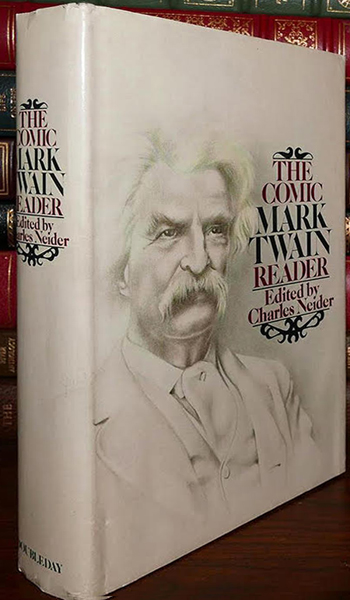
Cover illustration by Leslie Tucker
Leslie Tucker: Traditional artistic media was too slow for me, my mind always working faster than I could execute. In my BFA years, I embraced representational image-based acrylic painting and graphite pencil rendering, yet spent entire nights in the darkroom exploring analog photography and perfecting my printing skills. In post-graduate work at Parsons School of Design, I spent hours rendering visual stories in graphite, often combined with colored pencil and overlays of hand-tinted acetate. The effect was similar to a hand-tinted photograph and in an attempt to feed myself, I illustrated book jackets using this technique (image to the left). But the process of drawing was too slow, especially with tight deadlines. Doubleday gave me three days to create a highly specific Mark Twain portrait: white background, facing away from the spine, with room on the right for type. Within this deadline, I also researched and sourced photographs, scaled them, composed them, outlined them, rendered them, and finally created my signature hand-tinted acetate overlay. Doubleday was happy, but I realized this practice was unsustainable.
At Parsons, I began exploring juxtaposition which is the foundation of my practice today. But the exact moment when the idea of a photo-composite practice hit me was when my parents returned from Greece. I wanted to see their pictures of the Acropolis, but they hadn’t taken any. Commercial postcards were better, they said, and it dawned on me that rather than spend so much time drawing and painting, why not simply use photographs to explore themes in my work?
PWP: Why did photographs make their way into your work?
LT: I grew up watching television so got used to the onslaught of electronic photo-based images. In many ways, TV became my cultural landscape. But I also have a passion for consumer culture and a deep interest in decoding human nature. Once in NYC, Warhol’s pop-culture soup cans and soap pad boxes drew me into communication arts and packaged goods design. I loved the idea that I could influence the buying habits of Americans by graphically manipulating photographs of commodities. Over time, I’ve witnessed how the public’s familiarity with photographs has become its preferred method of choosing one product over another, most likely because of the widespread perception that photographs are “real.”
My communications arts practice eventually morphed into a visual arts practice, and evolved from exploring what we buy, to what we buy into. For three decades, I was one of those invisible hands, a behind-the-curtain graphic artist who crammed a data bank of photographic images into the public mindset; one of many visual strategists who influenced purchasing behavior and visually seduced the American public into buying more and more stuff. Today, I rearrange many of those same images to tell my own stories and explore my own themes. Why not use images the public already knows and trusts? I feel somewhat responsible for aiding and abetting America’s cheap, disposable economy, and as an act of repentance, have shaped my arts practice to comment artistically on all I’ve done.
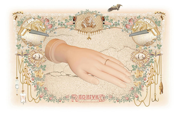
“Soulmate” ©Leslie Tucker
PWP: Where do you get your images?
LT: A typical day for me is spent sourcing thousands of images till I find just the right ones to place next to each other, as juxtaposition forms the foundation of my process. If I can’t find the image I want, I will photograph it myself. The hand in “Soulmate” (above) is a plastic version from China for manicure practice which I photographed then color-corrected in Photoshop to fit my vision.

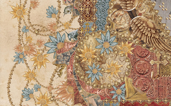
“Believer” ©Leslie Tucker
PWP: How do you work with and/or manipulate the images?
LT: Using software tools, I color shift, erase backgrounds and compose. I’m very particular about color, so each image is scrutinized and color-shifted for the exact amount of hue, saturation, brightness, and contrast in order to work within a chosen color palette. Composition takes up much of my art-making time because my visual elements are built from thousands of placed images. The flourishes and scrolls shown around the perimeter of “Believer” (above) are actually built from multiples of a praying hands statue image (below).

Detail of one image sourced for creating “Believer” ©Leslie Tucker
Another example in “Believer” is the series of flowers I created from candle-style light bulb images to contrast with my theme of willful blindness (below). I also built some Braille words out of brushed gold button images.
Light bulbs detail in “Believer” ©Leslie Tucker
In “MANIFESTO: Supreme Majesty” (below) the “text” is built from multiples of an image of a jess swivel used in training birds of prey, and the flourishes are built from an image of a king’s gold crown. A lot of my time is devoted to erasing those backgrounds. It took three to four days to silhouette that one antique bird cage image shown in “Supreme Majesty.”

“MANIFESTO: Supreme Majesty” ©Leslie Tucker
PWP: In a world awash with photos, why do they matter?
LT: Because photos visually preserve our times.
PWP: Did any particular artist inspire you in this direction?
LT: The photomontages of Martha Rosler and the graffiti stenciling of Banksy pair the profound with the superficial, deploying juxtaposition in a masterful way. Their bodies of work have inspired my own not only because of their dedication to important themes, but because they are skilled provocateurs who refuse to walk away quietly.
– Catherine Kirkpatrick